

The cost to paint the interior of a house in Seattle, WA depends on size, layout, type of surface, and more. Learn what factors can influence your total in this guide.
Some cues to pick the right hues


You’re ready to breathe new life into your interior space, but you find yourself wondering: what color should I paint my room? With thousands of options, deciding on just one can quickly get overwhelming. Use these tips to help create a cohesive, comfortable living space.
When it’s time to paint indoors, one of the easiest ways to choose a paint color for your room is to create a whole-house color palette. Choose two to four colors that are either complementary—on opposite sides of the color wheel—or analogous—on the same side of the color wheel. You can base these on personal preference, your existing decor, or inspiration you get from other peoples’ homes.
Alternatively, if you already have a color you like in your main area, build the color palette for the rest of your home around that. Choose colors that look good next to each other but are different enough to create distinct spaces or zones in your home.
Different colors create different feelings, so think about how you want your room to feel. If you’re painting a bedroom, choose a more neutral color to create a relaxing, inviting space where it’s easy to unwind. Pale blues and greens, lavenders, grays, and earthy tones are most popular in bedrooms because they create that sense of peace.
Consider going with a more vibrant and bold color in entertainment areas to keep guests and family members energized. Red, orange, yellow, and white paint colors tend to promote energy and wakefulness in a room.
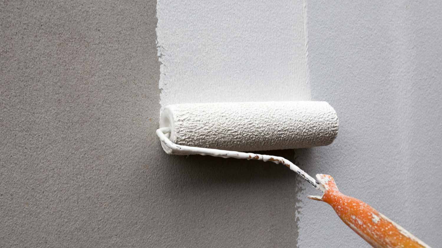
Test a color before you commit by painting large swatches on your walls and seeing how they look during different times of day.

Don’t confuse energy with mood when choosing paint colors. To set the mood, you can use complementary colors from opposite sides of the color wheel to promote a sense of balance and calmness, while analogous colors from the same side of the color wheel make a room feel more exciting, intriguing, and dramatic. This works regardless of the specific colors you choose.
If you have a base color for your main living area, use either complementary or analogous colors in other rooms to tie the home together while creating different moods in different zones. Complementary colors are best in bedrooms for tranquility and balance, and analogous colors are best in living rooms, dining rooms, and basement areas.
The 60-30-10 rule of interior designing suggests that you should cover around 60% of your space with a main color, 30% with a secondary color that’s either complementary or analogous, and 10% with an accent color. Use accent colors sparingly to bring a pop of life and energy into rooms designed for entertaining. You can even consider wallpaper instead of paint for a bolder accent wall.
One of the best ways to get the most value from interior paint is to work with what’s already in the space rather than changing everything. Think about hard finishes, like flooring colors, cabinets, and countertops, and find a color that complements those rather than painting your walls and then realizing you need to make other major changes to make your home look cohesive.
You can also consider the color of furniture, trim, doors, and windows to guide your decision. Otherwise, the low cost of painting a room may become a much more expensive home renovation.
Consider what kind of lighting you have in your room to guide color choices and paint finishes. If you’re painting a basement that gets minimal sunlight, choose a lighter color to brighten up the space and make it feel more open and airy. If you’re painting a sun-soaked kitchen, going a bit darker may not make the space feel as closed-off and gloomy.
The color of the walls around us can actually affect how we think and feel in a space, so lean on color psychology to choose a paint color for your room. Blues, greens, and earth tones tend to make us feel relaxed and comfortable, while reds, oranges, and yellows give us a sense of happiness and rejuvenation. Purples can inspire creativity, and pinks can even make us feel youthful and inspire love.

The square footage of your room can help you choose paint colors, too. Smaller rooms and hallways can quickly feel cramped and even claustrophobic if they’re too dark while living rooms and other entertainment spaces can feel uninvitingly large and distant if they’re too light.
Consider choosing an accent wall in particularly small or large rooms. One wall with a darker shade or color can artificially make a space feel larger while choosing a lighter color for an accent wall can make a big room feel a bit cozier.
Finally, you can use color to draw attention to certain aspects of your home. If you have beautiful, light-colored columns or wainscoting in your space, choose a darker wall color to make these features stand out more. If you have a dark granite countertop that you love, make it a focal point of your kitchen or bathroom by choosing a lighter wall color for contrast. You can also accentuate pieces of decor you’re particularly fond of or even views of the outdoors using this same technique.
Even with these tips and tricks for choosing the right color for your room, the options can still be overwhelming. Don’t be afraid to hire a local interior painting company to help you decide and create a more cohesive and inviting living space. Just be sure to hire a painter who can offer interior design advice, as some just provide the basics.
From average costs to expert advice, get all the answers you need to get your job done.
The cost to paint the interior of a house in Seattle, WA depends on size, layout, type of surface, and more. Learn what factors can influence your total in this guide.
The cost to paint the interior of a house in Minneapolis, MN depends on size, layout, type of surface, and more. Learn what factors can influence your total in this guide.
The cost to paint the interior of a house in Indianapolis, IN depends on size, layout, type of surface, and more. Learn what factors can influence your total in this guide.
Wondering how much it costs to stripe a parking lot? Learn about average prices, key cost factors, and tips to save on your next parking lot striping project.

From stone, tile, wallpaper, or paint, discover different accent wall ideas for your space.

Paint on metal doesn’t have to be permanent. Learn how to remove paint from metal yourself with various household methods.