


If you’re painting the interior of your home, you may be seeking a complementary color for the walls. Check out these paint colors that go with white trim.
Highlight your natural wood accents for a stunning look

Choosing woodwork colours that contrast with your trim creates visual interest, with lighter walls complementing darker wood and darker walls enhancing lighter pine or maple trim.
Consider your room's other permanent elements like flooring and countertops when selecting wall paint colors to ensure everything works together harmoniously with your wood trim.
Test paint samples on your walls at different times of day to see how natural light affects each color next to your specific wood trim tone.
Hiring a local interior painting professional provides expert guidance on color selection and ensures precise application that makes your natural wood trim truly stand out.
Painting your home lets you easily turn a room into your perfect space. At the same time, it can be challenging to pick the right colors. That’s especially true if you’re working with natural wood trim. Understanding which paint colors go with wood trim is crucial for creating a cohesive look and making the natural material pop in your space.
Here are the outlet types you find in most U.S. homes:
15-amp, 120-volt (2-prong and 3-prong): The standard household outlet for lamps, TVs, and chargers.
20-amp, 125-volt: A higher-power outlet for kitchens, laundry rooms, and workshops.
240-volt (20-amp to 50-amp): A large-appliance outlet for dryers, ranges, and EV chargers.
GFCI: A shock-protection outlet for kitchens, baths, and other wet areas.
AFCI: A fire-protection outlet for bedrooms and living spaces.
Tamper-resistant: A child-safe outlet with internal shutters, now standard in new homes.
Weather-resistant: A corrosion-resistant outlet built for outdoor use.
Convenience types: Switched, combination, USB, smart, and rotating outlets.

White has a reputation for being boring, plain Jane, and sterile. But, when paired with medium-to-dark wood trim, white walls are effortlessly gorgeous.
The contrast between the light, airy walls and the darker natural tones of the wood baseboards and moldings creates a bold effect without committing to bright or wild colors on your walls. This pairing is a great choice for more intimate spaces and for rustic or contemporary farmhouse decor styles. If you’re working with warmer wood tones, look for a creamy shade with amber or yellow undertones.
For inspiration:
Glidden® Aria
Sherwin-Williams Alabaster
Farrow & Ball Farrow's White
Valspar® Du Jour

If you’re looking for a more modern paint color with wood trim, look for a sleek shade of light greige. This blend of gray and beige can range from deep and dramatic to pale and delicate.
While light greige gives a fresh and airy feel, it’s not quite as stark as some whites can be on four contiguous walls. If the tone of your wood trim is dark, look for a light greige with a cooler, blue-tinged undertone. If you have a lighter-color wood, like pine or maple, feel free to go a bit lighter with your greige to minimize the contrast.
For inspiration:
Sherwin-Williams Guild Grey
Sherwin-Williams On the Rocks
Valspar® Tempered Gray
BEHR® Seagull Gray

If white and white-adjacent pale tones feel too stark or cool for your style, turn to beiges and tans. These colors often get mocked as boring, but that’s easily countered with the right furnishings and fabrics. They’re especially attractive next to mid-toned trim with warm honey undertones.
There are a large number of shades available in these colors, so paint a few test panels to ensure you pick the right shade for your room.
For inspiration:
Glidden® Rocky Road
Clare Turbinado
BEHR® Studio Clay
Sherwin-Williams Balanced Beige

For a wall color with slightly more impact, look for a light-toned shade that combines gray and green. Mid-range tones can look great with warmer, lighter-toned trim. The lighter the shade, the paler it will look in a large room, especially one with lots of natural light, so try a few different shades to pick the one that works best with the precise wood tone in your space.
Add plants, large potted trees, and prints that evoke nature for an indoor oasis that’ll quickly become the most relaxing room in your house.
For inspiration:
Sherwin-Williams Aloof Gray
Farrow & Ball Mizzle
Valspar® Quiet Mint
Sherwin-Williams Conservative Gray

Another high-impact choice is a light, icy, crisp blue shade. This tone is an excellent choice if you painted your trim white. It can create a sense of airiness and lightness that makes everything from work to relaxation a bit more enjoyable. It’s also a great choice for wood stains on the darker end of the spectrum, as it lets you amp up the contrast and really draw attention to your natural trim.
Icy blue shades add a pop of color without overpowering the rest of the room’s decor or the natural beauty of the trim without making the room feel dark or cave-like.
For inspiration:
Valspar® Wisteria Snow
Donald Kaufman Color DKC-44
BEHR® Ice Mist
Farrow & Ball Borrowed Light
If you’re looking for a paint color that evokes nature but makes a slightly bolder design statement, consider mid-range greens. These colors mirror grass and leaves, which are natural design partners for wood tones. At the same time, if you restrict yourself to slightly muted tones, you’ll maintain a certain level of elegance and flair.
Look for colors that mimic the colors of moss and grass. You can also choose warm tones or cool ones, depending on your design preferences and specific wood trim colors.
For inspiration:
Valspar® Rolling Glen
Sherwin-Williams Dill
Valspar® Gloaming Green
Sherwin-Williams Broccoflower

If pale pastels and off-whites don’t float your boat, you can also go in the opposite direction. Choose a dramatic dark shade to set off those lovely natural baseboards and window sills.
Look for shades with deep blue undertones to make lighter tones of wood the centerpoint. In fact, navy blue is one of the best paint colors that go with pine wood. It’s a striking approach that helps create a cozy yet sophisticated atmosphere that lends itself to a number of design styles, from traditional to contemporary.
Dark colors might be a little intimidating if you’ve never used dark paint before, but they’re not as daunting as they might seem at first. Experiment with decorative touches like mirrors as well as throw pillows and art in lighter shades to help balance out the walls.
For inspiration:
Clare Goodnight Moon
Sherwin-Williams Anchors Aweigh
Glidden® Black Forest
Valspar® Blue Coal

Play with the light tones in your pine or maple by pairing it with a light, airy yellow. Choose a slightly more saturated yellow for an intriguing pop or a yellow that’s closer to white to make that natural pine really stand out.
For inspiration:
Sherwin-Williams Lily
Sherwin-Williams Daybreak
Valspar® Champagne Tickle
Farrow & Ball Tallow

Balance your browns by adding a darker hue with your lighter pine-colored trim. You can choose to go with an earthier dark brown or a richer espresso shade. Either way, your browns will complement each other beautifully when you’re finished.
For inspiration:
Sherwin-Williams Black Bean
Sherwin-Williams Deep Forest Brown
BEHR® Dark Truffle
Farrow & Ball Cola

Terracotta paint brings a cozy, earthy warmth to a space, making it feel grounded, inviting, and full of character. It works well in rooms where you want a relaxed, natural vibe. Think boho living rooms, rustic kitchens, or southwestern-inspired bedrooms. This color family pairs beautifully with light to medium wood trim, like oak or maple, because it echoes the warm undertones in the wood without blending in too much.
For Inspiration:
BEHR® Terra Cotta Clay
Sherwin-Williams Cavern Clay
Sherwin-Williams Spiced Cider
Farrow & Ball Red Earth
| Paint Colors | Matching Trim Shade |
|---|---|
| Dark brown | Light, light-medium |
| Gray-green | Light, light-medium |
| Light blue | White, dark |
| Light greige | Medium, medium-dark |
| Mid-range green | Medium, medium-dark |
| Navy blue | Light, medium-light |
| Tan/beige | Medium |
| Terracotta | Light, light-medium |
| White/Off-white | Light, light-medium |
| Yellow | Medium |
Knowing what paint colors go well with wood trim is the first step, but choosing the specific shade and hue is another thing that can be intimidating. We have a few tips to help make the process a bit easier for you.
Think about your other hard finishes. Matching your trim and making it pop is great, but if your paint color clashes with other hard finishes, like flooring, countertops, and cabinets, your room won’t look well put together. Think about all of the permanent elements in your space and try to choose a paint color that meshes well with everything.
Contrast the shade with your trim. Wood trim often has the biggest impact on a room when it contrasts with your paint color to make it pop. If you have a lighter trim, consider a darker wall color. Working with walnut, mahogany, or another dark wood species? Consider a lighter wall color to create a drastic and stunning contrast.
Draw on the natural wood colors. It might be helpful to start with the natural wood tones you have and pull inspiration from that. If you see reds or yellows in your wood, consider similar colors for your paint and just go with a lighter or darker shade. This can create a cohesive look while still making the trim stand out.
Get samples. It’s always a good idea to get paint samples to see what it actually looks like next to your trim. Sometimes, a color that looks good in the store doesn’t look so good when the natural light in your home hits it. Bring home some samples and check how each looks and feels in your room at different times of the day.
Hire a professional. When in doubt, don’t be afraid to hire a local interior painter or interior designer to help you choose. Experts can often draw on experience, color psychology, and trends to help guide you to the right paint color.
Custom Paint Jobs LLC is the go-to choice for all your painting needs. They painted both the interior and exterior of my house flawlessly. Their work speaks for itself!
 Custom Paint Jobs, LLC
Beginning with the estimate, Larry and Peyton were super helpful in getting my new condo's interior re-painted. Not only was the job well done, but also done in a super timely manner as promised.
 Five Star Painting of Plain City and Powell
From average costs to expert advice, get all the answers you need to get your job done.
If you’re painting the interior of your home, you may be seeking a complementary color for the walls. Check out these paint colors that go with white trim.
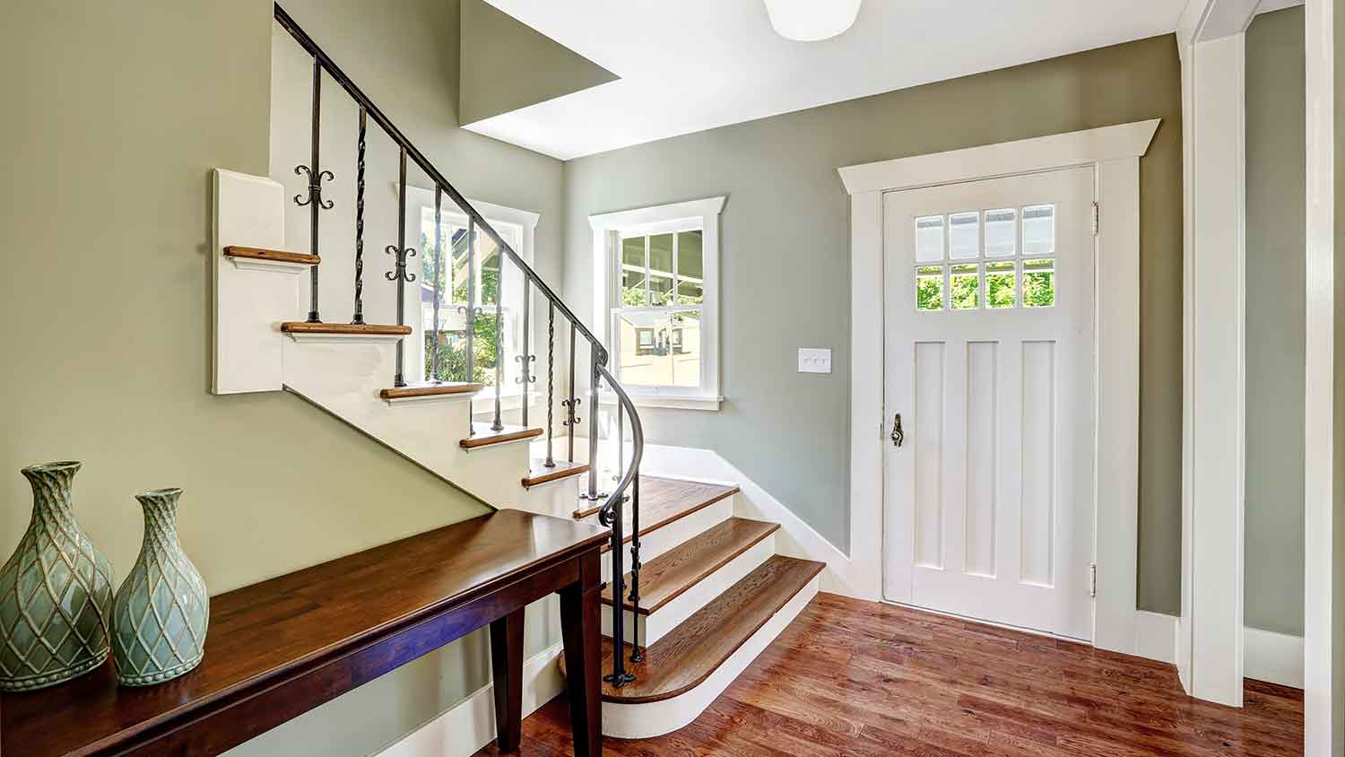
Interior trim creates cohesion and a refined finish in any room. Learn what finish works best in your home with this guide to the best paint for trim.
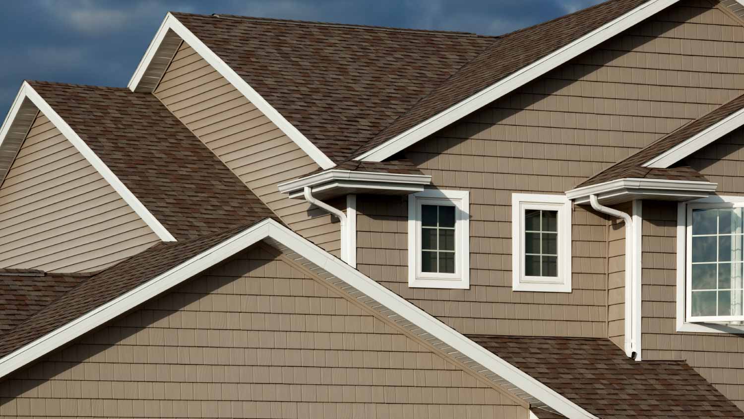
The best trim colors for a dark brown house range from classic neutrals to unexpected pops of color. This guide walks through the top hues for your home’s trim.
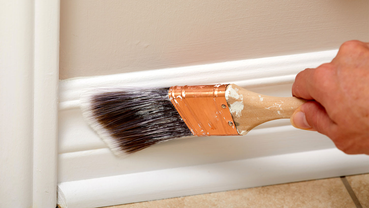
Is there a huge difference between stained trim vs. painted trim? The right choice for your molding and baseboards depends on your home.

Deciding on an overall color scheme for the interior of your house is stressful. Going through the process? Here are the best white wall and trim color combinations.

Learn the best paint colors for interior and exterior trim, whether you wish to go bold with black or stay neutral with whites and beige.