

The cost to paint the interior of a house in Raleigh, NC depends on size, layout, type of surface, and more. Learn what factors can influence your total in this guide.
Paint colors are the ultimate mood setter


Your home's interior should be comfortable and express your unique style. Choosing a paint color for your home creates a backdrop that complements the home's architecture, furnishings, and decor. Learn how to choose paint colors for your home's interior to design a home that meets your aesthetic.
If you don't already have an idea of which design style you prefer, turning to print or online magazines can help. Look for color schemes you enjoy or colors you think might suit your home's decor. At this point, simply collecting ideas about what you like can guide you in the right direction to find your home's perfect look.
You can also take your research to a local interior painting company for help finding the right colors. The cost to paint a room ranges between $400 and $1600, and hiring a pro can ensure you make the right design decisions the first time.
Color can dramatically affect how a space feels and functions. For example, soft, calming tones work well in bedrooms to promote relaxation, while bold, energizing colors can enhance creativity in a home office or playroom. Light shades of paint can make a small room feel more open and airy, while darker colors can add coziness and depth to a large or sparsely furnished space.

Light can significantly alter how a color appears, and it can vary throughout the day. Natural sunlight reveals a color’s truest tone, while artificial lighting, whether warm or cool, can shift the hue. In rooms that lack a lot of light, it is best to choose a lighter paint color over a darker one. The light color will help brighten the room, and a dark shade has the opposite effect.
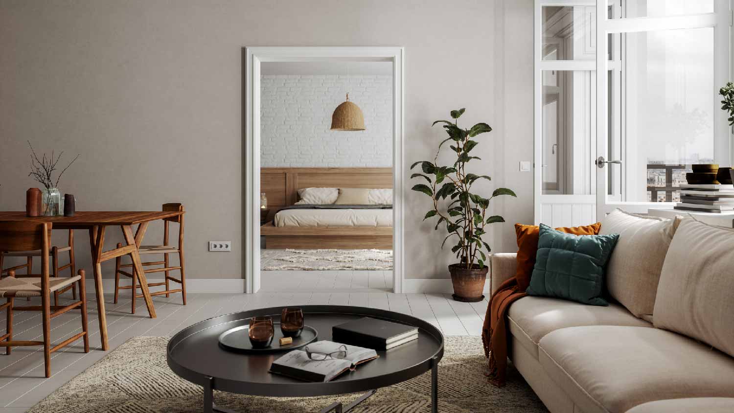
Colors that complement each other from one room to the next enhance visual continuity and are more aesthetically pleasing. When colors don't blend well together, the home can feel disjointed or chaotic. In open-concept layouts or homes with connected living areas, abrupt color changes can be jarring. A color palette that flows smoothly between rooms can make the space feel larger and more unified.
A color scheme provides a clear, cohesive guide for making color decisions across your home. Whether it’s monochromatic, complementary, or based on a favorite palette, a well-defined color scheme ensures that all the shades used work well together, reducing the risk of clashing tones or an unbalanced look. It also makes decorating easier, as furniture, décor, and accents can be chosen to match or contrast intentionally.
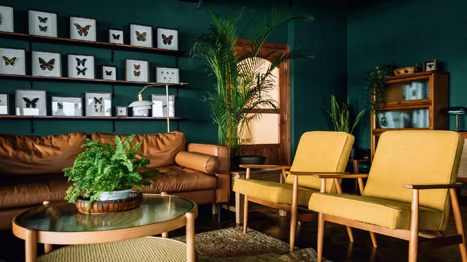
Going all neutral or all bold in your home can feel uninspired. Instead, opt for a balance that creates visual interest without being overwhelming. Neutrals provide a timeless, soothing backdrop that works well in most rooms and makes it easier to layer in furniture and décor. Bold colors can add personality, highlight architectural features, or define specific areas like an accent wall.
A great way to blend both is to pair neutral and bold together. Opt for bold paint colors that go with white trim for a neutral contrast. When combined thoughtfully, neutrals and bolds create depth, contrast, and a dynamic look that feels stylish.
If you’re looking to freshen up your home before putting it on the market, keep in mind that neutral colors have a broader appeal to homebuyers because they act as a blank canvas and give off a calming, clean vibe.

Undertones are subtle hints of color beneath the main shade that can dramatically affect how a color looks in your space. Two colors that appear similar at first glance may clash once on the wall if their undertones don’t align with the room’s lighting, flooring, or furnishings. For example, a gray with blue undertones will feel cooler than one with brown or purple undertones, which can change the entire mood of the room.
Think about what's already part of your home as well. You'll want to consider paint colors that go with wood trim if you aren't replacing your trim or interior doors. Understanding undertones helps ensure your paint complements the existing elements in your home and prevents unexpected color mismatches.
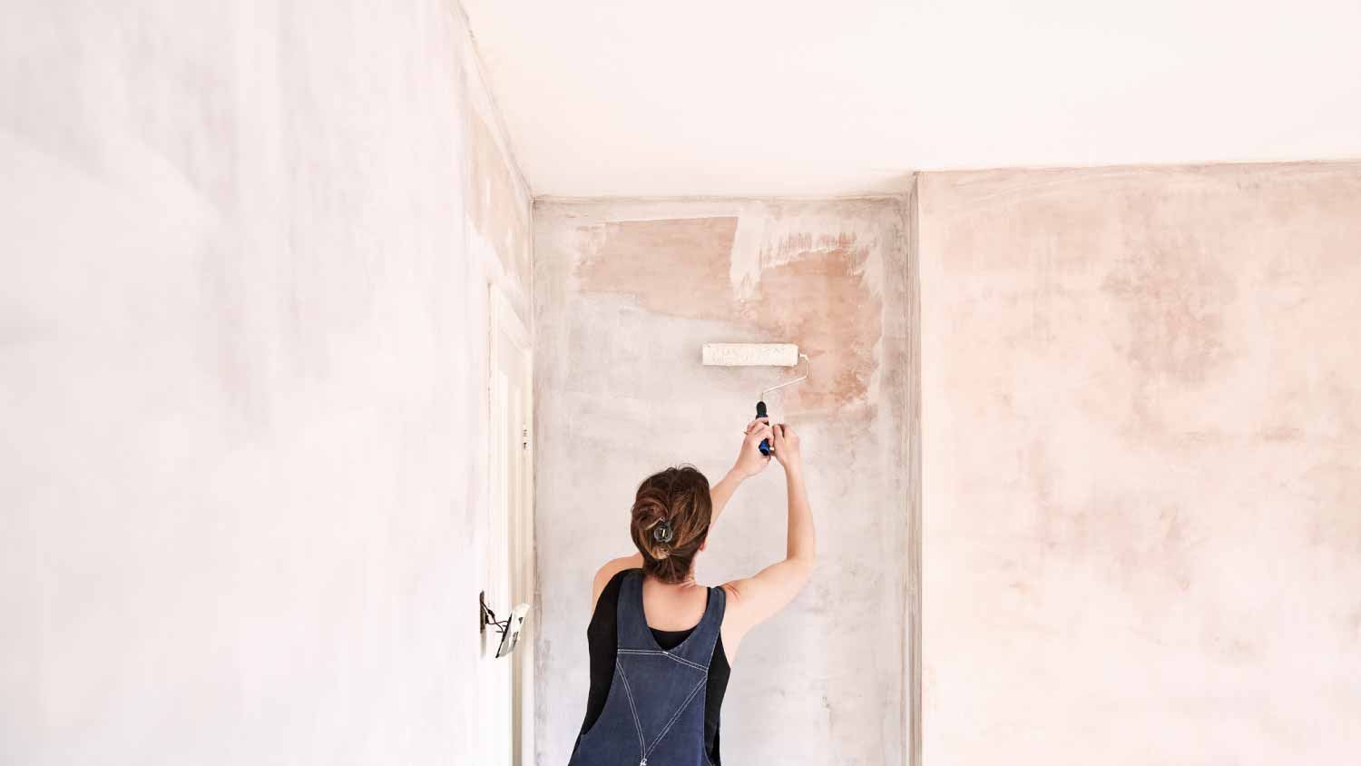
Before you commit to a new paint shade, you want to test it out in your space. Paint can appear very different depending on the room’s lighting, surrounding furniture, and even the time of day. By applying sample swatches to your walls, you can observe how the color changes and interacts with other elements in the room. This approach helps you avoid costly mistakes and ensures you pick a shade you’ll be happy living with long term.
Your wall color should complement the pieces you already have if you're not starting to design your space from scratch. Your sofas, rugs, artwork, and accent pieces all contribute to the room’s overall aesthetic, and choosing a paint color that clashes can throw off the entire look. Coordinating paint with your existing color palette ensures harmony and helps highlight your favorite furnishings rather than compete with them.
From average costs to expert advice, get all the answers you need to get your job done.
The cost to paint the interior of a house in Raleigh, NC depends on size, layout, type of surface, and more. Learn what factors can influence your total in this guide.
Limewash can add timeless texture to your living space. The cost to limewash interior walls depends on factors like surface area, materials, and prep work.
The cost to paint the interior of a house in New York, NY depends on size, layout, type of surface, and more. Learn what factors can influence your total in this guide.

If you no longer love the look of wood paneling, you don’t need to remove it. Learn four ways to cover wood paneling for a fresh look.

Knowing what type of paint is ideal for your project will give you the best results. Learn about different types of paint and what to use them for.

German schmear and whitewash both brighten outdated brick. Find out about all the differences between German schmear and whitewash right here.