

Not sure what color you should paint your room? Don’t get overwhelmed by the countless options. Use these tips and let your inner interior designer shine.
Roses are red, violets are blue, here’s how color theory can help you

Understanding color theory helps you choose harmonious color schemes for your home by learning how primary, secondary, and tertiary colors work together on the color wheel.
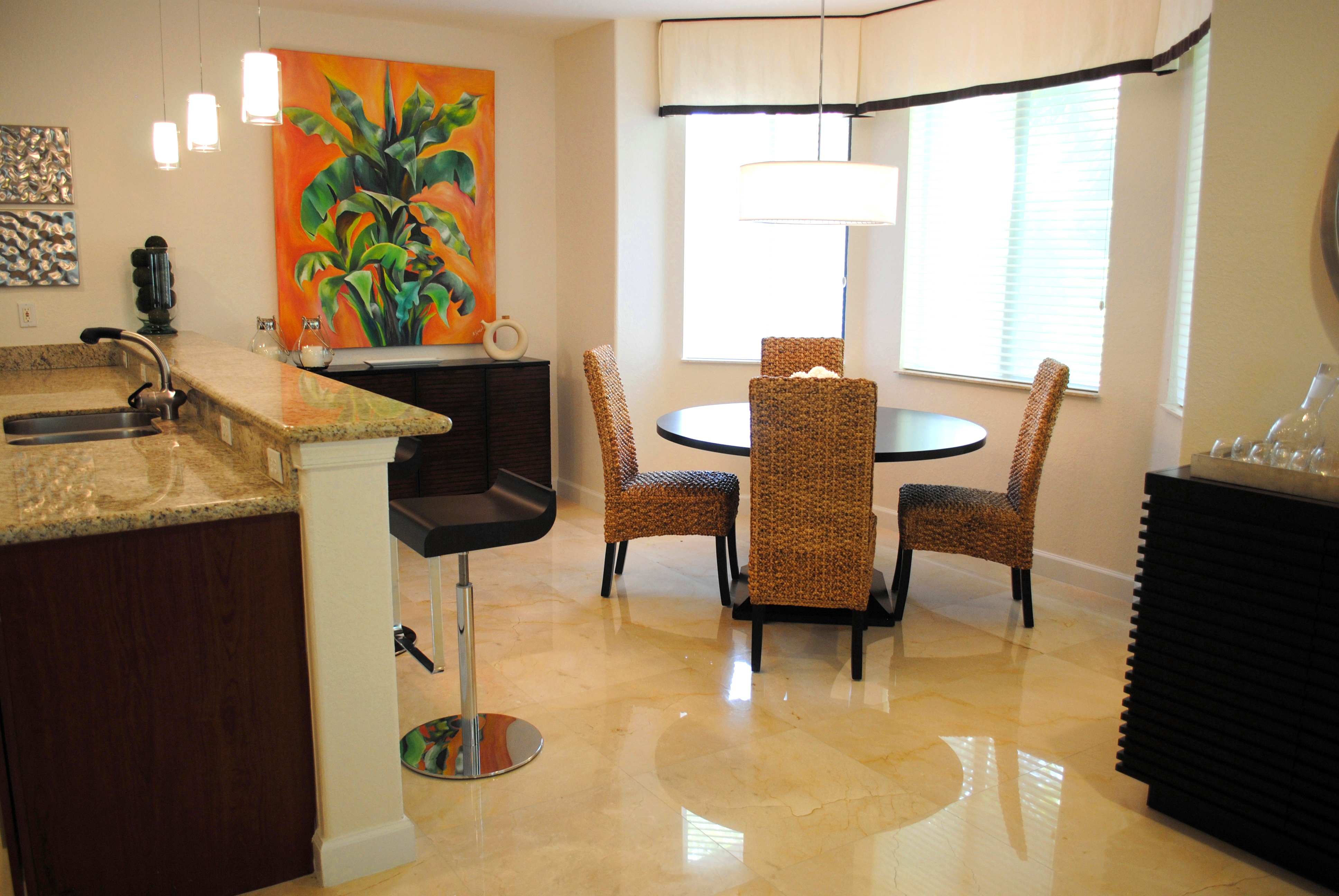
Color relationships like complementary, analogous, and monochromatic schemes guide your palette decisions, while the 60:30:10 ratio keeps your space balanced with dominant, secondary, and accent colors.
Your geographical environment and existing home features affect how colors appear, so bright yellows shine in cloudy climates but disappear in sunny destinations.
Hiring a local interior decorating professional provides expert guidance on color schemes and proportions, helping you create cohesive, harmonious spaces that reflect your style.
Picking a color scheme for a home can feel downright impossible with all the shades and combinations there are to choose from. You may think you’ve picked the perfect mix of bold home decor hues, only to discover that they fall surprisingly flat when actualized. Fortunately, understanding the basics of color theory can make the process of selecting a color scheme much more manageable—no need for a degree in design.
The next time you’re having trouble deciding between colors for a space, harken back to the days of finger-painting and remember what your teachers taught you about mixing different shades. And if you can’t recall what you learned about the color wheel back then, allow this guide to refresh your memory.
Color theory is the study of different hues and how they work best together. Designers and visual artists rely on it as a blueprint for creating cohesive and harmonious color schemes. The specifics of color theory are wide-ranging and could fill countless books, but there are a handful of key principles the average person needs to remember when it comes to choosing a palette for their home.
Though we’re all familiar with the color wheel, that iconic, circular rainbow is not always as simple as it appears. It’s intended to be a visual representation of the most logical arrangements of different colors. But it’s been rethought in countless different ways since it was first invented hundreds of years ago by Sir Isaac Newton.
The most common color wheels are composed of three main subcategories:
Primary colors: Red, yellow, and blue are known as primary colors because they’re the colors from which all others are derived.
Secondary colors: Green, orange, and purple are secondary colors because they are formed by mixing primary colors.
Tertiary colors: These are the colors formed by mixing primary colors with secondary colors. Tertiary colors often have two names, like red-orange or blue-green.
Color wheels are typically split into two respective sides of warm and cool colors. These are the colors that commonly fall into these categories.:
Warm colors: This category includes any hues with undertones of red, pink, yellow, or orange.
Cool colors: These colors are characterized by blue-green undertones.
Though most colors fit into one of these two categories, there are a few shades that buck the trend and embrace a mixture of warm and cool tones, like chartreuse and plum.
Understanding how colors relate to each other is essential for choosing a streamlined palette. There are many different ways of pairing colors, but these are some of the most common color schemes.
Analogous: This involves pairing any three colors that are side by side on a color wheel, like red, orange, and yellow, for example.
Complementary: Complementary colors are two shades placed directly opposite each other on a color wheel. These colors find harmony in contrast—for example, blue and orange or red and green.
Split-complementary: This is slightly more complex than complementary color schemes because it involves three colors rather than two—one base color and two secondary colors.
Triadic: This type of color scheme relies on three equally spaced shades from a color wheel. It usually features one warm tone and two cool tones or vice versa.
Monochromatic: Though monochromatic schemes rely on just one color, they make use of all the different tones and shades within that single hue, resulting in dynamic and harmonious results even from the most basic beige.
Natural: When in doubt, observe the world around you to find a perfect color pairing. Draw inspiration from the plants, water, and earth and you’ll be surprised at how peaceful your home starts to feel.

There are a number of characteristics that we automatically associate with certain colors, from the fierceness of red to the joyousness of yellow. Numerous studies have shown that the feelings these shades create aren’t just anecdotal.
But there’s also plenty of evidence that the way we react to colors is highly individualized. A shade that might make one person sad may make another as happy as can be. But in general, these are some of the most common characteristics we generally associate with different colors.
Red: powerful, intense, passionate, bold
Orange: optimistic, open-minded, charismatic
Yellow: energetic, joyous, welcoming, fun
Green: prosperity, hopeful, restorative, generous
Blue: calm, informed, tranquility, peace
Purple: creative, luxurious, devoted
Always remember to consider the context of your situation when picking a color palette. The way that a color reacts to its surroundings can totally change the impact it has. A dark, green door may stand out against a light blue house, but will probably fall flat when paired with similarly dark siding.
But it’s not just the pre-existing elements of your home that are worth taking into consideration, because your geographical environment can have just as much as a negative or positive effect. Bright yellows may disappear into the background in sunny destinations, but they’ll shine through in cloudy climates.
Now that you know a bit more about the specifics of color theory, here’s how to apply your newfound expertise to real-world situations.
When you’re not sure exactly how to divvy up all the different shades from a color palette, using a ratio of 60:30:10 will ensure that your space always feels balanced and harmonious.
Pick one dominant color to fill 60% of the area, a secondary color to fill 30%, and reserve the remaining 10% for accents. For example, apply the dominant color to your walls, the secondary color to your furnishings, and save the accent colors for small accessories or minor design elements like window frames and cabinet doors.
This rule works for almost every type of color scheme, even the ones that feature fewer than three colors. For monochromatic palettes, rely on different shades and tones within the chosen color to create the same level of depth.
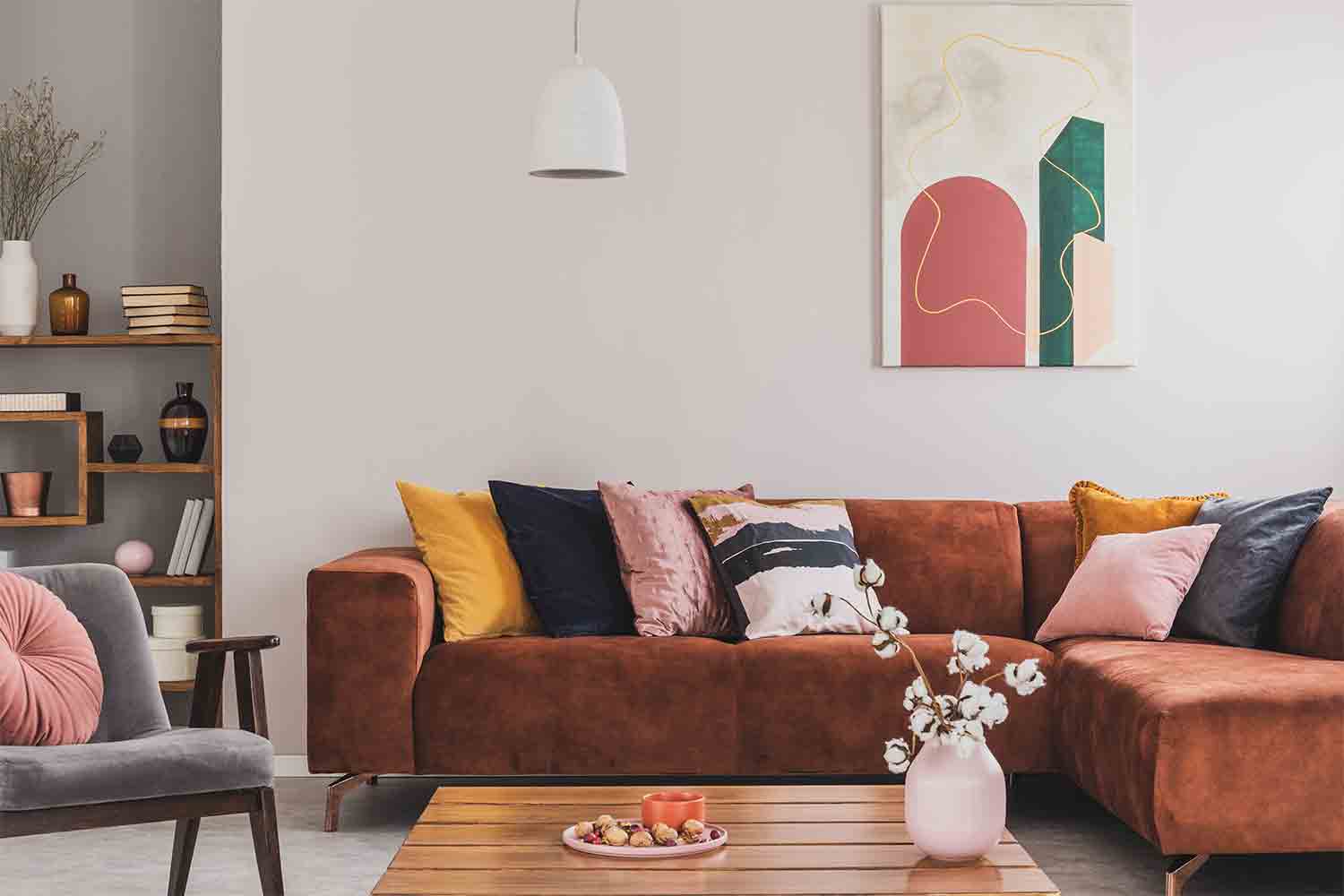
Though like goes with like when it comes to color, contrast is definitely not off the table. Mixing metal furnishings with warm colors can bring balance to a space. On the flip side, a dark shade of paint or deep-hued area rug can do a great job of grounding a light and airy room.
Both the texture of your possessions and the level of light in your home will impact the way that colors feel in the space. Icy blues will feel colder amongst hardwood flooring and polished, silver finishes, and warmer when paired with soft, plush accessories and light, creamy accents. And soft LED lights will make a pastel green feel gentler than harsh fluorescents.
Using color theory successfully isn’t a one-and-done process. It’s only through trial and error that you’ll really learn what works and what doesn’t. Save yourself unnecessary setbacks by planning your color scheme as much as possible in advance. Put together inspiration boards to better imagine what it will look like in action, or use digital visualizers to see what it will actually look like in your space.
We have bought and sold numerous times over the past 50 years. Sherman Hall and Top Line are top notch. Thorough and detailed, he explains every possibility, probability, and eventuality. High class and pleasant. The best.
 Top Line Home Inspections, LLC
Supreme Brick & Chimney did a great job with a cleaning and inspection of the fireplace! He was efficient, on time, and very pleasant. The space was kept very clean, and the fireplace was spotless when he was done. He also performed a thorough inspection, and did a great job talking us...
 Supreme brick & chimney
Custom Paint Jobs LLC is the go-to choice for all your painting needs. They painted both the interior and exterior of my house flawlessly. Their work speaks for itself!
They were very helpful with design, very quick to respond, good quality work, and competitive pricing!
On time, clean and finished fast. Windows seem sturdy and the finish is good. Caulking was done with no smudges. Would recommend.
If I could give 10 stars for Kitchen Tune Up, I would. I cannot say enough good things about my experience with Kitchen Tune Up and the entire team involved in the process of my kitchen project. They went above and beyond as far as service and quality with my cabinets, paint, countertops, and...
Beginning with the estimate, Larry and Peyton were super helpful in getting my new condo's interior re-painted. Not only was the job well done, but also done in a super timely manner as promised.
 Five Star Painting of Plain City and Powell
Great job...edging and pre clean up went well with a great job with seal coat. Friendly, efficient and professional.
 All Star Paving and Sealing
We were having 2”x 2” tile installed . There was a small installation error and the new additional replacement tile was from a different lot and the colors didn’t match. Joe assured us that he would rectify everything , which he did without hesitation. We decided to go with the 18” x 36” tile...
 CarifaTile
We live in a condo and had space to add a tall cabinet. The problem was the space was already occupied by our catsâ litter box. We needed to still keep the litter box in that same corner. Beiler Custom Cabinets was able to work with our need and design request. What was created was an...
From average costs to expert advice, get all the answers you need to get your job done.
Not sure what color you should paint your room? Don’t get overwhelmed by the countless options. Use these tips and let your inner interior designer shine.
Interior designers use color as one of their main tools when creating beautiful interiors. Learn the psychology behind colors to plan your interior design.
The 60-30-10 color rule could be a helpful resource during your next DIY design. Here’s how to apply it to your interior design strategy, as well as ideas for adjusting the formula to decorate your home in exciting new ways.
If your home has windows galore, you’ll want to pick a color scheme that plays to that advantage. Use these paint colors for rooms with lots of natural light.
Understanding the basics of color temperature will help you use lighting to set a different tone in every part of your home, from cool and tranquil to warm and cozy. Learn how to do so here.

Not sure how to pick exterior house paint colors? We’ve got 11 tips that will help you with your decision paralysis.