
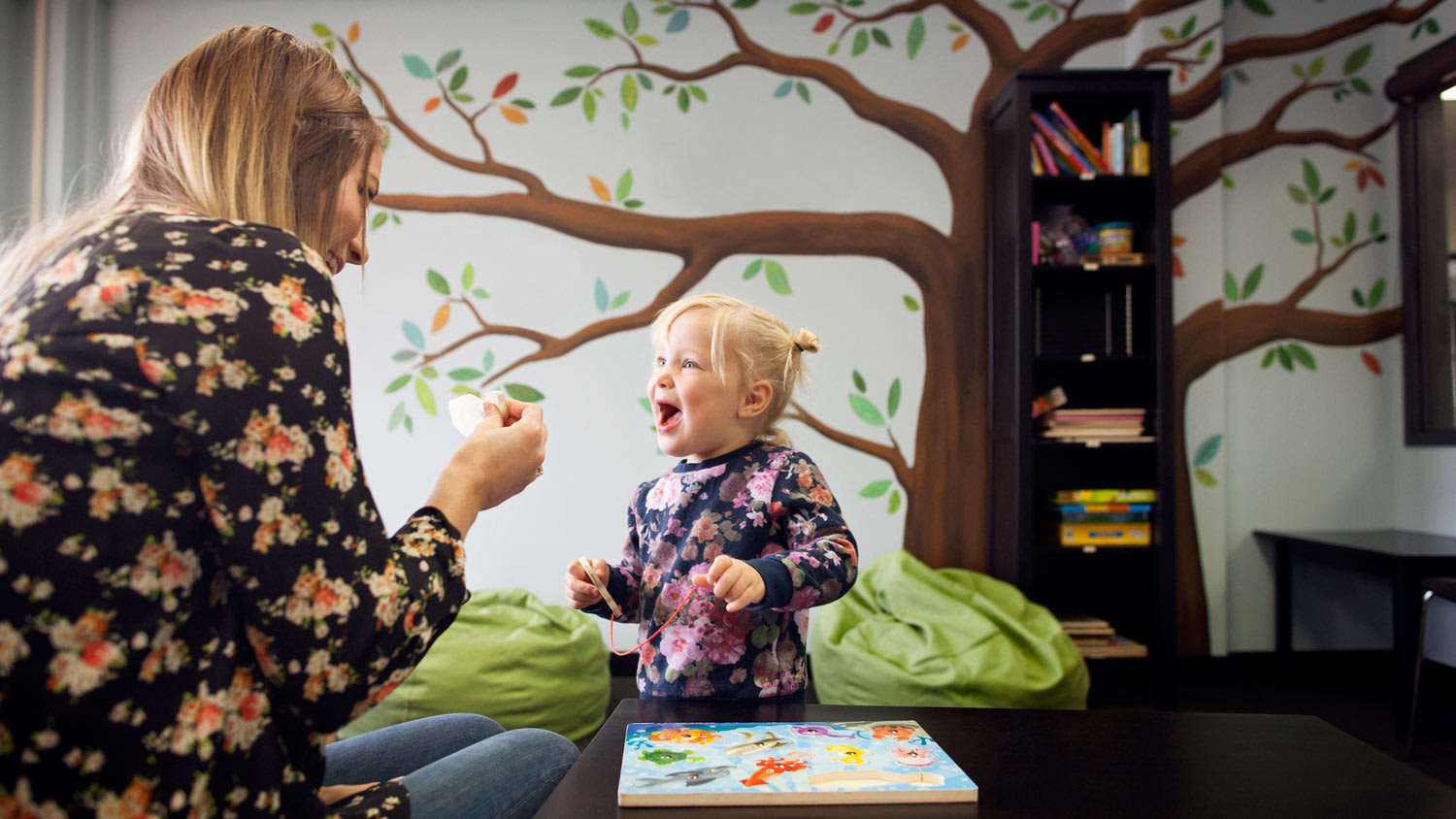
Looking to design the perfect playroom? Get inspired by these creative paint ideas that will instantly create an imaginative place to play for your little one.
The best colors for wall-to-wall peace

Calm colors for your home include soft grays, pale blues, sage greens, and off-whites that create tranquility and make rooms feel peaceful.
You can pair darker calming shades like hunter green or charcoal with lighter trim to balance mood without overwhelming your space with color.
Your room's natural light determines which calming paint colors work best, as darker hues need more sunlight to avoid feeling too moody or heavy.
Hiring a local interior painting professional provides confident guidance on undertones and lighting, ensuring your calming color choices create the peaceful atmosphere you want.
Whether you’re painting a single wall or are working on creating a whole-house color palette, getting the color right is crucial for establishing the mood and energy you’re looking for in your living space. If you want to create calmness and peace in your home, it’s a good idea to use some color psychology to nail the vibe. Use these calming paint colors to level the energy a bit and create tranquility in your home.

Green calls to mind images of nature, which many find soothing and relaxing. A darker hue, like sage green, can add a touch of warmth to your space while still bringing the feeling of the outdoors inside.
Darker shades of sage green are best reserved for full walls in rooms that receive plenty of natural light to prevent the color from feeling too moody or overwhelming. You can also pair darker shades with light-colored trim, interior doors, and decor to add warmth without going too dark or use them on accent walls or furniture to add a pop of calming color to your space.
For inspiration:
Sherwin-WilliamsⓇ Sage Green Light
BEHRⓇ Sage Garden
GliddenⓇ Dark Sage
Benjamin MooreⓇ Dry Sage

Pale blues are a nice alternative to darker shades of green because they still invoke a sense of nature—think sky and natural sources of water—without being overwhelming. Color psychology suggests that pale blues also inspire inner reflection, which can add a subconscious calming effect to your room. Go with a cooler blue to maintain some calm energy in offices and entertaining rooms, and choose a warmer light blue for bedrooms.
Pale blues are great for full walls in rooms that don’t see a lot of natural light, like hallways and bathrooms, because they naturally brighten up your space and make it feel airy. Consider pairing with a darker blue color on an accent wall to make your room feel larger, and white trim and interior doors for a fresh look.
For inspiration:
Sherwin-WilliamsⓇ Atmospheric
BEHRⓇ Light Drizzle
GliddenⓇ Blue Light
Benjamin MooreⓇ Light Blue

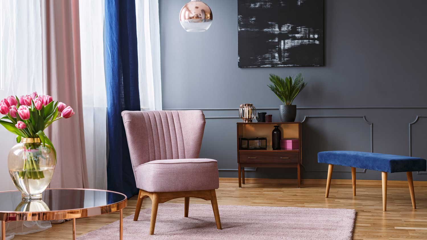
Soft grays are some of the most popular calming paint colors because they’re neutral. This makes them unobtrusive and easy to dress up with small pops of color in furniture, accent rugs, or decor to add just a touch of soothing energy. Soft grays often have delicate undertones to add depth to your space. Choose a cooler undertone like blue or green for a natural calming effect, or go with a warmer undertone like yellow or red to make your room feel cozy and calm.
For inspiration:
Sherwin-WilliamsⓇ Mindful Gray
BEHRⓇ Soft Secret
GliddenⓇ Solstice
Benjamin MooreⓇ Gentle Gray

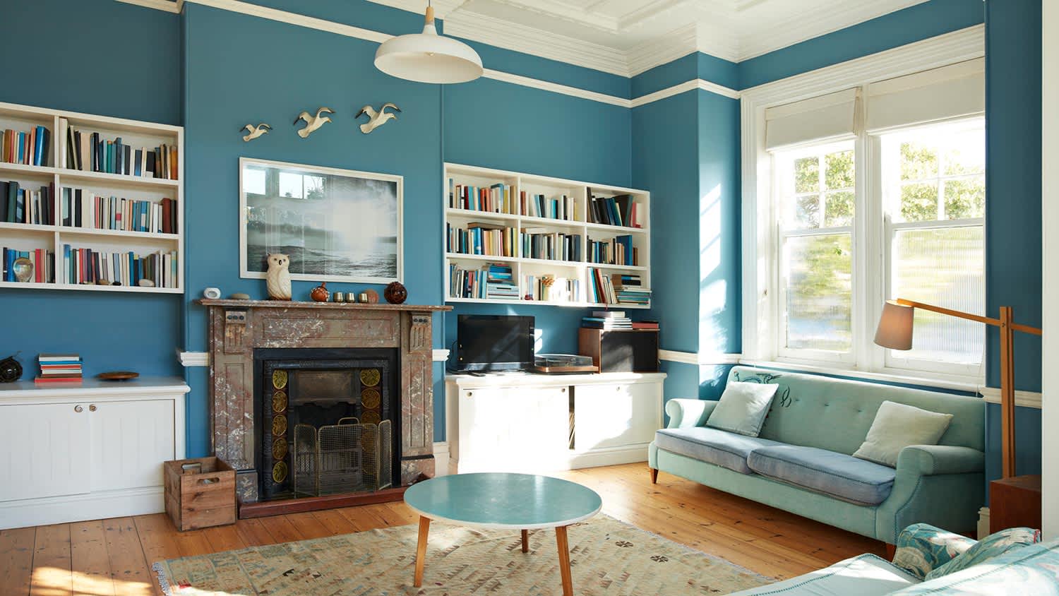
Dark blues like navy are bolder options, but they still bring tranquility to your space and can make you and your family feel like you’re immersed in nature. Darker shades of blue can also promote creativity and introspection, so they could be the ideal calming paint colors for offices. They can also do well in bedrooms, as they limit light reflectance, which can help bring down the energy in preparation for sleep.
Dark blues can sometimes feel like too much on entire walls, but you can always use them on cabinets, mantels, accent walls, or furniture to bring in color and calmness while keeping your walls a more neutral color.
For inspiration:
Sherwin-WilliamsⓇ Dark Night
BEHRⓇ Dark Cobalt Blue
GliddenⓇ Rich Navy
Benjamin MooreⓇ Hale Navy

Terra Cotta is a good option if you want to make your space feel more natural and connected but aren’t a fan of greens and blues. Terra Cotta is a natural clay color that remains more neutral and a bit more understated, but it can still invoke a feeling of tranquility.
Lighter shades can keep your space feeling a bit airier and maintain a calming energy, while darker shades tend to be more relaxing. Consider how much natural light your space gets when choosing a shade, and think about how your trim and door colors will add to or detract from the brightness of the paint.
For inspiration:
Sherwin-WilliamsⓇ Rookwood Terra Cotta
BEHRⓇ Terra Cotta Clay
GliddenⓇ New Terra Cotta
Benjamin MooreⓇ Baked Terra Cotta

Deep browns are bolder than terra cotta, but a darker hue can ramp up the relaxation while still feeling natural and neutral. It pairs well with lighter-colored trim and white-washed wood furniture, and you can really make your space feel natural and inviting by adding some live plants, natural stone decor, or furniture that incorporates concrete for some added texture.
Deep browns are best reserved for bedrooms that see lots of natural light, as you can close the shades to keep the space dark and relaxing or open them to brighten things up.
For inspiration:
Sherwin-WilliamsⓇ Dark Brown
BEHRⓇ Chocolate Therapy
GliddenⓇ Chocolate Moment
Benjamin MooreⓇ Chocolate Candy Brown

Charcoal is another bold color option for inducing tranquility, so it’s often a good choice for accent walls, interior doors, furniture, or cabinets, where the other walls are a lighter gray. Charcoal calls to mind natural stone, so you still get the relaxing sense of nature without introducing the more common blues and greens to bring the outdoors inside.
As a darker hue, it’s best reserved for bedrooms or offices where you have the option to bring in some natural light through windows. Avoid using it in hallways and basements, as you may find it too dark and moody. When in doubt, hire a local interior painter to help you decide how to use this darker color effectively in your space.
For inspiration:
Sherwin-WilliamsⓇ Charcoal
BEHRⓇ Graphic Charcoal
GliddenⓇ Elegant Charcoal
Benjamin MooreⓇ Kendall Charcoal

Hunter green may very well be the ultimate calming paint color. It transports you right outside to a thick forest, providing a deep feeling of nature and tranquility. It also invokes feelings of purity and health, so it can be subconsciously revitalizing in addition to bringing the colors of nature indoors.
Like other darker hues, hunter green can feel overwhelming if you overdo it. Consider using it on an accent wall to bring peace to a living room, cabinets to add a touch of natural beauty to a kitchen, or in a bedroom to immerse yourself in nature as you drift off to sleep. Hunter green can also spark creativity and imagination, so consider it for offices or workspaces, too.
For inspiration:
Sherwin-WilliamsⓇ Dard Hunter Green
BEHRⓇ Equilibrium
GliddenⓇ Dark Hunter Green
Benjamin MooreⓇ Bavarian Forest

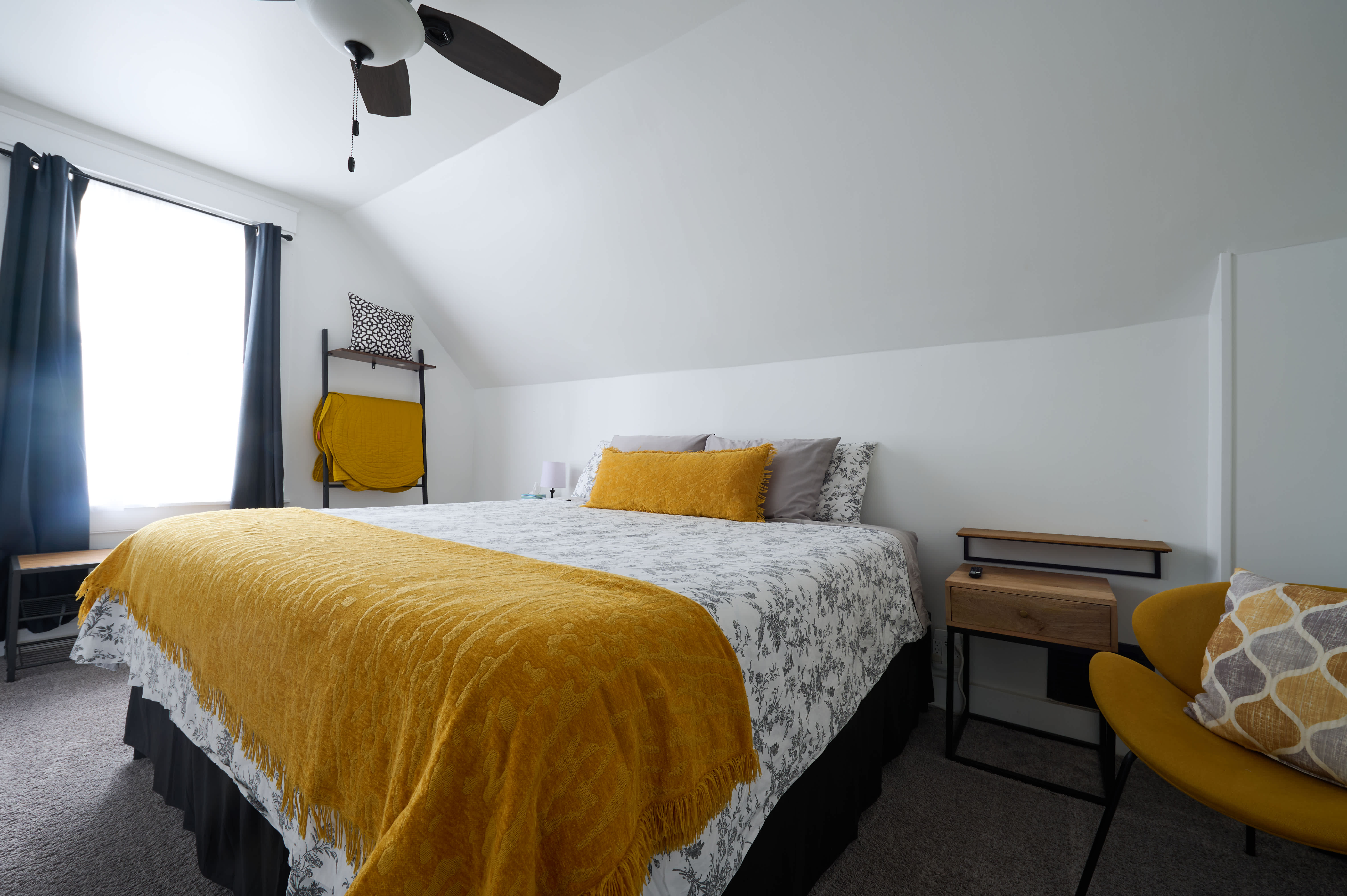
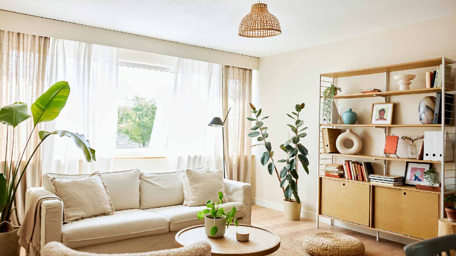
While searching for calming paint colors, it’s easy to overlook shades of white, but this is a mistake. White invokes a sense of purity and innocence while also brightening up a space, so the right shade of white can make your home feel peaceful and fresh, all while remaining neutral and easy to decorate. The feeling of purity it creates makes it a particularly good paint color for nurseries. You can easily use off-whites to cover entire walls without the color feeling overwhelming or obtrusive.
The best white paint colors that offer a feeling of tranquility often have warmer undertones and a lower light reflectance value (LRV) to limit the energy they bring to your space. Add a touch of natural warmth by pairing with dark wood trim, interior doors, and furniture.
For inspiration:
Sherwin-WilliamsⓇ Alabaster
BEHRⓇ Bit of Sugar
GliddenⓇ Cappuccino White
Benjamin MooreⓇ Simply White
Custom Paint Jobs LLC is the go-to choice for all your painting needs. They painted both the interior and exterior of my house flawlessly. Their work speaks for itself!
Beginning with the estimate, Larry and Peyton were super helpful in getting my new condo's interior re-painted. Not only was the job well done, but also done in a super timely manner as promised.
 Five Star Painting of Plain City and Powell
From average costs to expert advice, get all the answers you need to get your job done.
Looking to design the perfect playroom? Get inspired by these creative paint ideas that will instantly create an imaginative place to play for your little one.
Your paint color affects how your bedroom looks and feels. Learn about the best bedroom paint colors and the top-rated paints to choose from.
Looking to refresh your living space but overwhelmed with the color options? Check out these popular paint colors to for some inspiration.
Choosing interior paint colors can send you into a multi-colored panic. Take a deep breath and read these eight tips to help you pick out the perfect hues. We can help you find the ideal paint color so you can relax and enjoy your home.
Overwhelmed by painting choices? Here's how to choose paint colors for your home interior to blend space functionality with your unique style.
If your home has windows galore, you’ll want to pick a color scheme that plays to that advantage. Use these paint colors for rooms with lots of natural light.