

Knowing a thing or two about color theory will ensure you always have the tools to choose the right hues for your home and personal preferences.
Unleash your inner interior designer with this simple formula

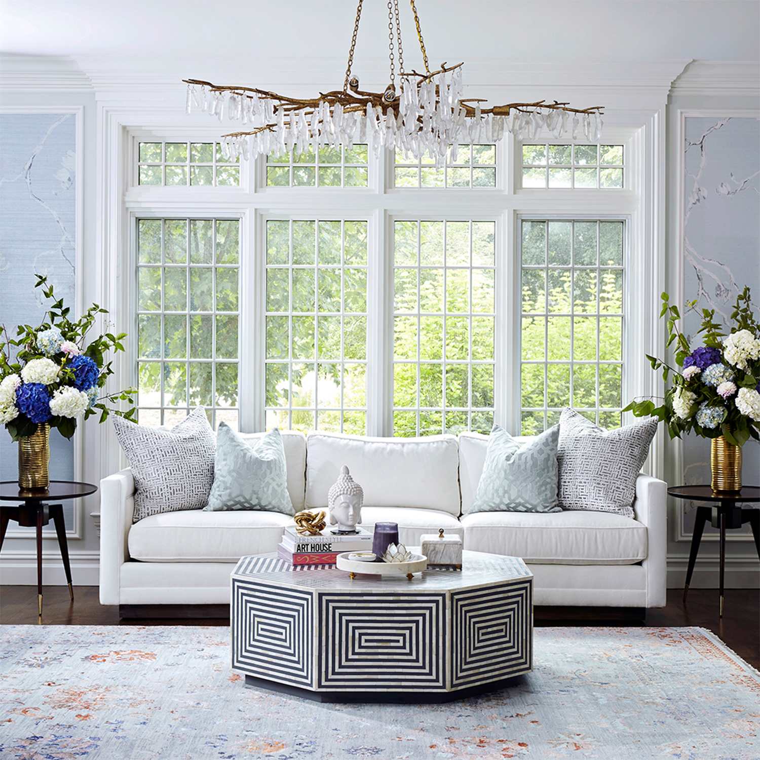
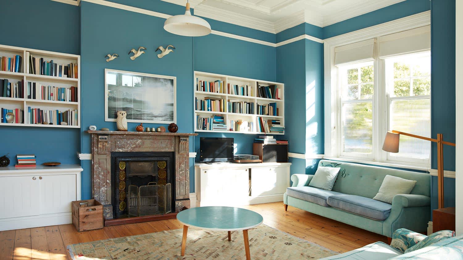
The three color rule in interior design uses a 60-30-10 formula to balance your space with one dominant color, one secondary color, and one accent color.
Dominant colors cover 60% of your room through walls, rugs, and large furniture, while secondary colors fill 30% through curtains, accent chairs, and bed linens.
The accent color appears in 10% of your space through decorative pieces like throws, pillows, and artwork, letting you add personality and visual interest.
Hiring a local interior decorating professional helps you create a balanced color scheme that matches your home and lifestyle while avoiding common design mistakes.
If flipping through the latest issue of your favorite design mag did nothing to stir your creative juices for a magazine-worthy interior design scheme, it’s time to try the 60-30-10 rule. This tried-and-true formula helps you balance three central colors in one room, creating a foundational scheme full of color pops and splashes. The best part? The rule has as many configurations as there are colors in the rainbow. It’s truly up to you to find the best three shades that match your home, lifestyle, and personality. Here’s how to use the 60-30-10 rule during your next design project.
The 60-30-10 is a classic rule of interior design. When defining a color scheme under this rule, it states that 60% of your space should be one dominant color, 30% a secondary color, and 10% an accent color.
The secondary color should complement the dominant color but still pop. The accent color is your opportunity to add a lot of fast flair through fun accessories, artwork, and decorative pieces. Here are some ways to use the rule in a room:
Walls
Rugs
Large furniture like sofas or sectionals
Curtains
Accent or side chairs
Bed linens
Accent walls
Throws
Pillows
Artwork
Frames and accessories
Here are a few suggestions of ways you can use the 60-30-10 rule to create some professional-looking pizazz in your home.
In a bathroom, where white is almost always the dominant color, consider a brighter tone. You might try a primary pastel blue or pink color for your walls (using variations of the same color for your tiles) and then leverage an all-white vanity, lounge chair, and shelves to establish your secondary color. With these palettes, your accent color could be beige, grey, or even a toned-down metallic.
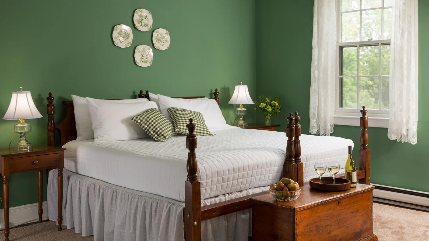
Soft green or yellow tones are simple ways to freshen up your bedroom, provided you balance the rest of the room according to the rule.

If you love the idea of a dramatic black or dark navy wall, the 60-30-10 rule will help you implement this bold choice to the perfect degree. Consider pairing a dark wall with lighter, softer neutrals, such as beige, white, or pale grey.
Just don’t forget to factor in the color of your more permanent room features; a dark wall might clash with dark wood floors and furniture. But teak and other lighter wood tones? Those will pop in all the right ways!

Believe it or not, the 60-30-10 rule works beautifully with wallpaper, especially if it is multicolored. For example, a floral print wallpaper with shades of pink, green, and blue could act as a primary color alongside a neutral secondary color. Just choose an accent color that highlights some of the shades found in the wallpaper, and then incorporate it via decorative pillows or a small painting.
Don’t be afraid to deviate from the 60-30-10 rule if these design ideas have you feeling confident and defiant. Here are a few ways to color outside the lines:

What if, instead of choosing one accent color, you choose two? Under your new formula (60-30-10-10), you could design something like grey as your primary color, green as your secondary color, and yellow and beige/gold as your two accents.
Monochromatic designs can be just as stunning. For example, if you love pink, commit to pink. Then use the rule to vary your hues and textures in the room. Consider using hot pink, baby pink, or a complementary shade of mauve in your interior design. Wallpaper with a print in the same color family you’ve chosen is another excellent way to vary pattern and texture in a space.
The formula is not so much about ratios as it is about varying colors. Every space is different, and it’s possible that a different formula works for your home. Whether it’s 30-30-20-20 or 50-40-10, stick to a plan so your color scheme doesn’t spiral out of control. A local interior designer can help brainstorm ideas if you find yourself stuck without a vision.
We have bought and sold numerous times over the past 50 years. Sherman Hall and Top Line are top notch. Thorough and detailed, he explains every possibility, probability, and eventuality. High class and pleasant. The best.
 Top Line Home Inspections, LLC
Supreme Brick & Chimney did a great job with a cleaning and inspection of the fireplace! He was efficient, on time, and very pleasant. The space was kept very clean, and the fireplace was spotless when he was done. He also performed a thorough inspection, and did a great job talking us...
 Supreme brick & chimney
Custom Paint Jobs LLC is the go-to choice for all your painting needs. They painted both the interior and exterior of my house flawlessly. Their work speaks for itself!
They were very helpful with design, very quick to respond, good quality work, and competitive pricing!
On time, clean and finished fast. Windows seem sturdy and the finish is good. Caulking was done with no smudges. Would recommend.
If I could give 10 stars for Kitchen Tune Up, I would. I cannot say enough good things about my experience with Kitchen Tune Up and the entire team involved in the process of my kitchen project. They went above and beyond as far as service and quality with my cabinets, paint, countertops, and...
Beginning with the estimate, Larry and Peyton were super helpful in getting my new condo's interior re-painted. Not only was the job well done, but also done in a super timely manner as promised.
 Five Star Painting of Plain City and Powell
Great job...edging and pre clean up went well with a great job with seal coat. Friendly, efficient and professional.
 All Star Paving and Sealing
We were having 2”x 2” tile installed . There was a small installation error and the new additional replacement tile was from a different lot and the colors didn’t match. Joe assured us that he would rectify everything , which he did without hesitation. We decided to go with the 18” x 36” tile...
 CarifaTile
We live in a condo and had space to add a tall cabinet. The problem was the space was already occupied by our catsâ litter box. We needed to still keep the litter box in that same corner. Beiler Custom Cabinets was able to work with our need and design request. What was created was an...
From average costs to expert advice, get all the answers you need to get your job done.
Knowing a thing or two about color theory will ensure you always have the tools to choose the right hues for your home and personal preferences.
We're all hunting for simple and affordable ways to make out homes like high-quality and stylishly chic. Let's look at 10 tips to pull this off with ease.

Painting your window shutters is an easy way to enhance your exterior, but which hues work best? Keep reading to explore the best shutter paint colors.
Stepping into your bedroom should inspire the ultimate sense of serenity. These bedroom colors are the best hues for sleeping soundly and waking up refreshed.
Choosing interior paint colors can send you into a multi-colored panic. Take a deep breath and read these eight tips to help you pick out the perfect hues. We can help you find the ideal paint color so you can relax and enjoy your home.
Seeking the perfect color scheme for your mid-century modern house? We’ve got you. These are the most popular mid-century modern paint colors.